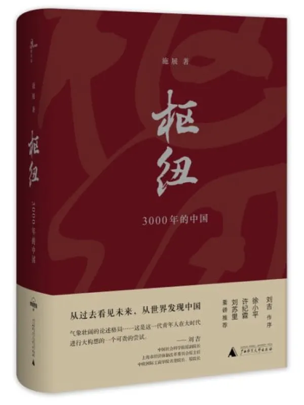
A ten-volume Chinese calligraphy collection naming Yan, Ou and Liu styles alongside regular, running, clerical, cursive and seal scripts.
Resource Overview
Complete Chinese Calligraphy: Ten-Volume Collection is a digital learning resource about Calligraphy. The English description summarizes the available source listing; the underlying recordings or books are in Chinese. An English translation of the full material is not confirmed.
What You Will Learn
Use the sequence and preview material below to identify the course’s scope, terminology and teaching approach. Check each topic against the original lesson rather than treating a short listing as a complete transcript.
Course Contents
- Calligraphic styles
- Historical model traditions
- Ten-volume reference set
Original Course Images


Who This Resource Is For
This resource is for readers or learners who can use Chinese-language materials and want a named resource on Calligraphy. Compare the stated scope and previews before ordering; a fixed level of prior experience is not assumed unless the source directory says so.
Learning Format and Digital Delivery
Ten Chinese-language digital volumes Virtual and downloadable; there is no physical shipment. Price: USD 9.00. A file link is not yet attached to this product. Please contact Karma Kismet before ordering to confirm delivery arrangements; immediate automated access is not promised.
Frequently Asked Questions
Is the full material in English?
No English edition, recording or subtitle track is confirmed. The source material is Chinese-language.
Is a personal consultation included?
No individual consultation is listed with this resource.
Does this resource guarantee an outcome?
No. It is for educational and cultural study, not a guaranteed result or substitute for professional advice.
Editorial Note
Karma Kismet translated and organized the course facts and original previews for English readers. Lesson counts and formats follow the available source listing; unspecified contents, certificates and instructor credentials are not asserted.
Related Courses
Browse Calligraphy and read digital delivery information.
Separating script families from named calligraphic styles
The source lists a ten-volume Chinese calligraphy collection and names Yan, Ou and Liu styles alongside regular, running, clerical, cursive and seal scripts. The two lists do different work. A script identifies a broad system of written forms, while a named style points toward particular conventions and models within calligraphic practice. Keeping that distinction visible is a useful first step for an English-speaking learner. The collection’s title should not be treated as proof that it contains every historical writer or every surviving work. Its confirmed scale is ten electronic volumes, and its exact contents should be checked in the books themselves.
Begin with a comparable pair
Choose two clearly identified examples in the same script before comparing different scripts. If a character appears in two named styles, it makes a useful controlled pair. Describe the overall proportion, the placement of components and the distribution of dark and open areas. Then identify a difference that can be seen without guessing the hand’s exact motion. This order keeps the comparison grounded in the reproductions. A style name may carry expectations, but those expectations should lead to observation rather than supply a conclusion before the examples have been examined.
A reader-created worksheet can contain three spaces: the shared character identity, features of the first example and features of the second. Write descriptive sentences instead of ranking the examples as better or worse. One may appear denser, another more open; the significance of that contrast depends on the whole form. Do not infer a personality from a visual adjective. Calligraphic appreciation can include personal response, but historical or stylistic claims require more than preference. The exercise helps learners discuss differences with precision while leaving room for the collection’s accompanying explanations to refine their vocabulary.
What a stroke image can establish
A reproduction shows the result of writing, including edges, direction and relationships among marks. It does not by itself record every adjustment of pressure, speed or tool angle. When a book explains those actions, compare the explanation with the visible result, but retain the distinction between an observed feature and an inferred movement. This is especially useful for beginners who may imitate an outline without understanding how it was formed. A copied shape can resemble the model in one respect while differing in the movement that generated it. The study should make that uncertainty explicit rather than promise exact technique from a static page.
Try practicing one limited relationship, such as the spacing between two components, instead of attempting an entire page at once. Before the attempt, state the intended adjustment. Afterward, compare the result with both the model and the earlier attempt. This produces a record of purposeful practice. Repetition alone is difficult to assess if every copy is judged only as generally good or bad. A specific feature gives the learner a reason for the next attempt and makes improvement visible without claiming that one exercise will establish mastery of Yan, Ou or Liu style.
Regular script and the arrangement of parts
Within regular-script examples, study how a shared component changes its position or proportion in different characters. A component is not necessarily an identical shape inserted into every whole. The surrounding parts can affect its width, height and relationship to the center. Find several examples that the collection actually supplies and compare them. This is a structural investigation rather than a rule invented for the set. It can help a learner understand why memorizing one component is only the beginning of writing a balanced character.
Running and cursive writing remain readable forms
When moving to running or cursive script, preserve the text identification beside the visual example. Connected or abbreviated forms can be misread if the learner treats them only as expressive marks. Ask what makes the underlying character recognizable within the example’s conventions. A comparison with a regular-script form may help, but do not evaluate the freer form solely by how closely it resembles that comparison. The scripts organize relationships differently. The useful question is how identity, continuity and visual rhythm coexist in the selected passage.
A small passage can be studied as a sequence rather than as isolated characters. Notice where spacing separates forms and where connection creates a larger unit of movement. Then ask whether the arrangement changes your perception of individual characters. This exercise should use a passage whose reading is supplied by the book or another dependable reference. An attractive guess at the text is not enough. Reading and looking reinforce each other, and the collection’s broad script coverage can support that relationship without requiring a beginner to copy every form immediately.
Clerical and seal-script observation
Clerical and seal scripts may present familiar character identities through unfamiliar structures. Begin with identification, then examine the distinctive arrangement of the selected form. Avoid treating an older-looking character as automatically equivalent to a modern one on visual resemblance alone. The source confirms that these scripts are included, but the precise forms and models must be established from the volumes. Record the script label and the book’s reading with each study image. This prevents later notes from conflating a historical character form, an individual style and a decorative adaptation.
Using history without replacing the example
Historical information can explain why a model is important, but prestige should not replace visual analysis. If a volume connects an example with a named writer or tradition, identify which part of the attribution is supported by its caption or discussion. Then return to the form and ask what feature the explanation draws attention to. A learner can respect a historical model while still needing to understand the relationships visible in it. Likewise, a pleasing reproduction does not by itself establish the date or authorship of the underlying work. Keep those evidentiary tasks separate.
When comparing examples from different periods, state the differences in witness and reproduction. A rubbing, a printed image and another reproduction may preserve different kinds of detail. The source listing does not confirm the medium of every example, so inspect the volume before making such a claim. If the medium is unclear, mark it as uncertain. This is a practical limit on comparison: a darker or rougher image may reflect its reproduction history rather than the calligrapher’s intended mark. Careful captions are therefore part of artistic study, not a distraction from it.
A ten-volume collection used selectively
A manageable route is to study one script and one named style at a time, then add a comparison when the vocabulary becomes clearer. Keep a short model list with references and a note about why each example was chosen. The list should reflect the actual collection, not a presumed standard canon. At the end of several sessions, revisit the first pair and describe it again. If the description is now more precise, the study has progressed even if the copies remain uneven. The enduring benefit is an ability to see, read and explain calligraphic differences with evidence rather than rely on a style name as an answer.